Exposed Dropdown Menu
A common input control for users to choose one option from an options menu.
Type
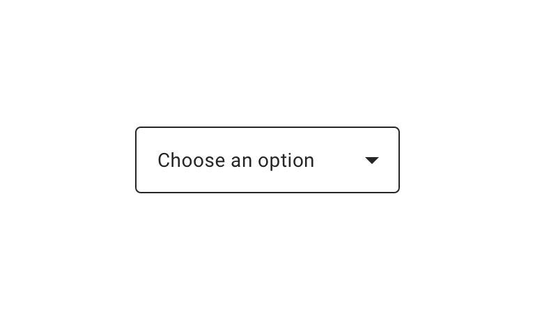
Default


Usage
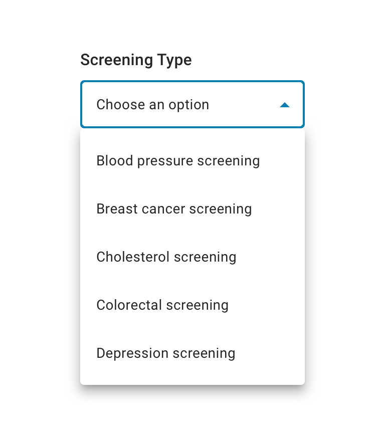
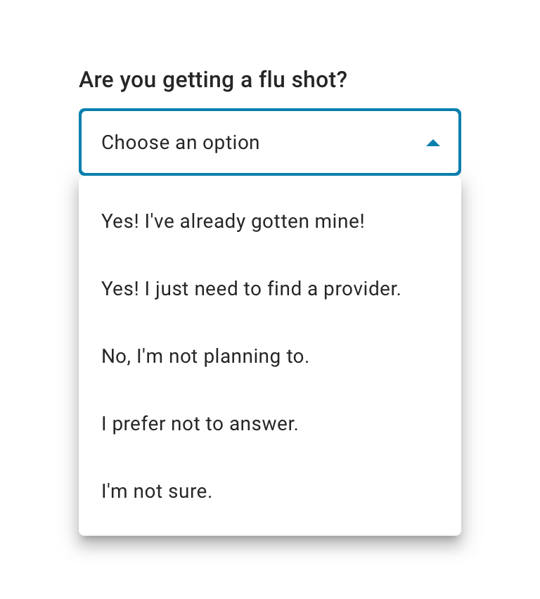
Use only when a single menu item can be chosen at a time. An Exposed Menu Dropdown works for shorter lists with familiar options, ideally 5-15 items. For fewer options, use a radio. For more than 15, enable search functionality.
Have a default option selected whenever possible. Use “Choose an option” as a placeholder option only if there’s no logical default option.

 Use for displaying multiple options from which a user can select only one

 Avoid using if the options are too wordy or long in content. Use Radio Button instead.
Behavior
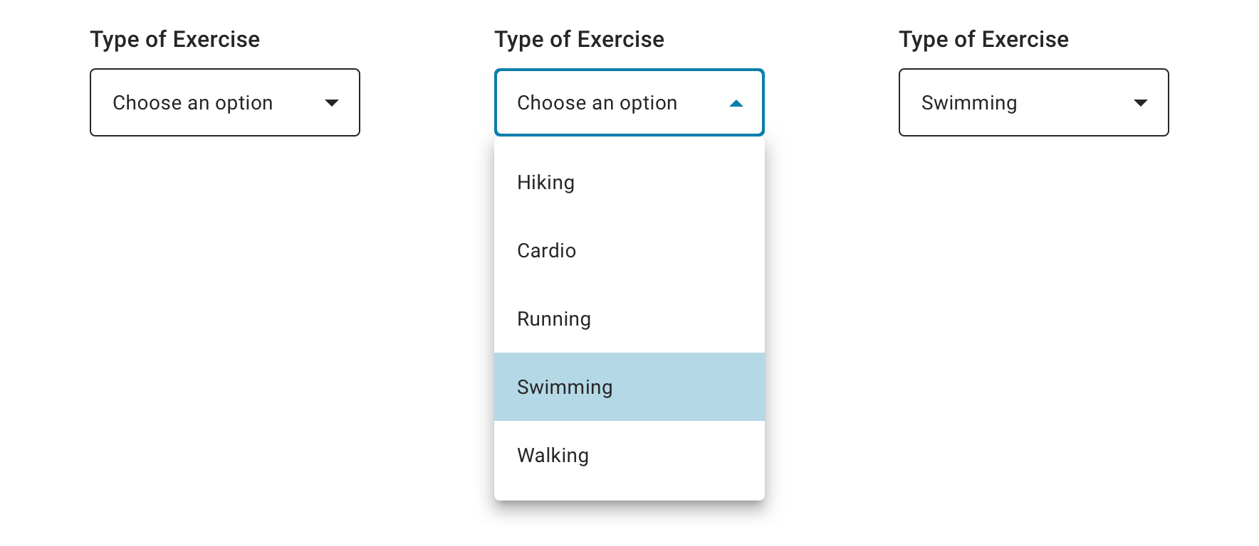
Upon selecting an item, an Exposed Dropdown Menu updates to display that item.

Visual style
Exposed Dropdown Menu can be variable width and should align to the content it’s paired with when appropriate.

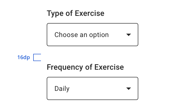 Vertically stack multiple dropdown menus
 Never rely on the placeholder text to explain the type of information intended for the menu. Always include a label.
Allow enough space in your interface or adjust the max-height to prevent the option list from expanding beyond the screen. The maximum height of a menu should be at least one row less than the height of the app’s UI.
Content Strategy
Labels
Labels for Exposed Dropdown Menu are typically direct, putting clarity and brevity over brand voice in most contexts.
Selection is implied, so omit actions. “State” suffices instead of “Select a State”.
- Aetna: Use Title case for labels
- CVS: Use Sentence case for labels
Placeholder & Options
“Choose an option” is built into the component as a placeholder for scalability and regularity.
Options should be:
- Short and sweet
- Tip: Wordier options are better presented as Radio Buttons.
- Uniform
- Organized (e.g. alphabetical, when appropriate / possible)
Errors
View Aetna’s error guidelines.
Accessibility
Characteristics
- Best used to select a single option from a list between 5 - 15 options
- Label clearly identifies purpose for Exposed Dropdown Menu
- Options logically ordered, alphabetically if appropriate
- Use a default option when possible, only use a placeholder if a logical default option isn’t available
Focus Expectations
- Tap presents a list of options
- User navigates through option list and makes a selection by tapping
- If a selection is made, list of options collapses and focus returns to Exposed Menu Dropdown with selected option in field
Screen Reader Expectations
- Reading Order: “{Exposed Dropdown Menu label}, {selected value, if applicable}, dropdown list, {Error message, if applicable}”
- Menu Options Open: “{Exposed Dropdown Menu label}, popup window, {first option}, in list, tap to activate”
- Tapping popup window reads number of options, for example “showing items 1 to 9 of 15”
- If Disabled: “{Exposed Dropdown Menu label}, {selected value, if applicable}, dropdown list, disabled”