Checkbox
A common input control for users to select one or more options from a number of choices.
Types
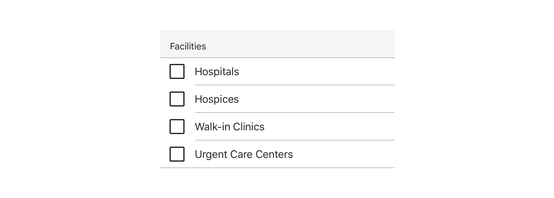
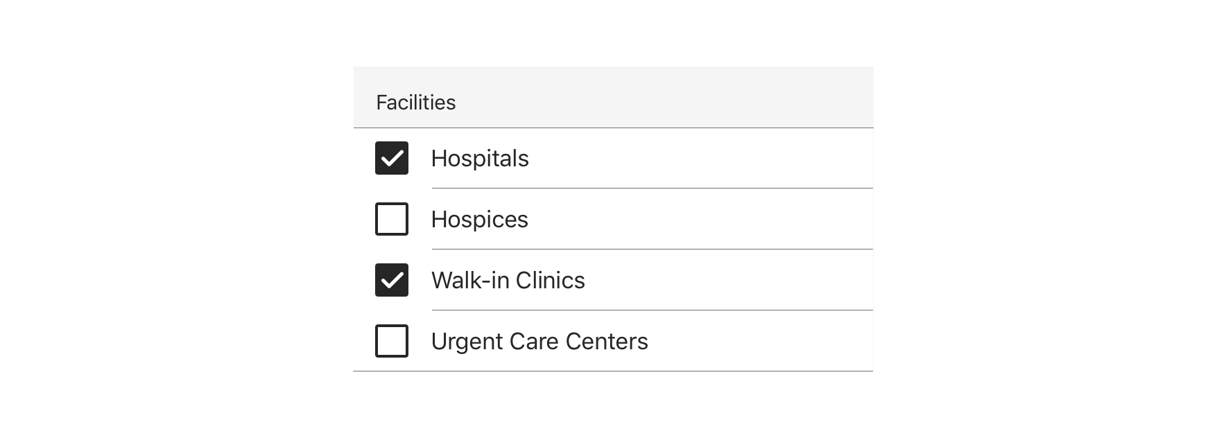
Basic


Table Cell


Usage
Use for forms where users can choose from a group of options.


 Use in a Table for common form layouts


 Checkbox groups should always have a Section Header that clearly defines or explains what the grouped options are for


 Use for forms where users can make multiple selections


 Use for forms where users can toggle something on or off


 Avoid pairing with other interactive elements, such as a tooltip or link
Behavior


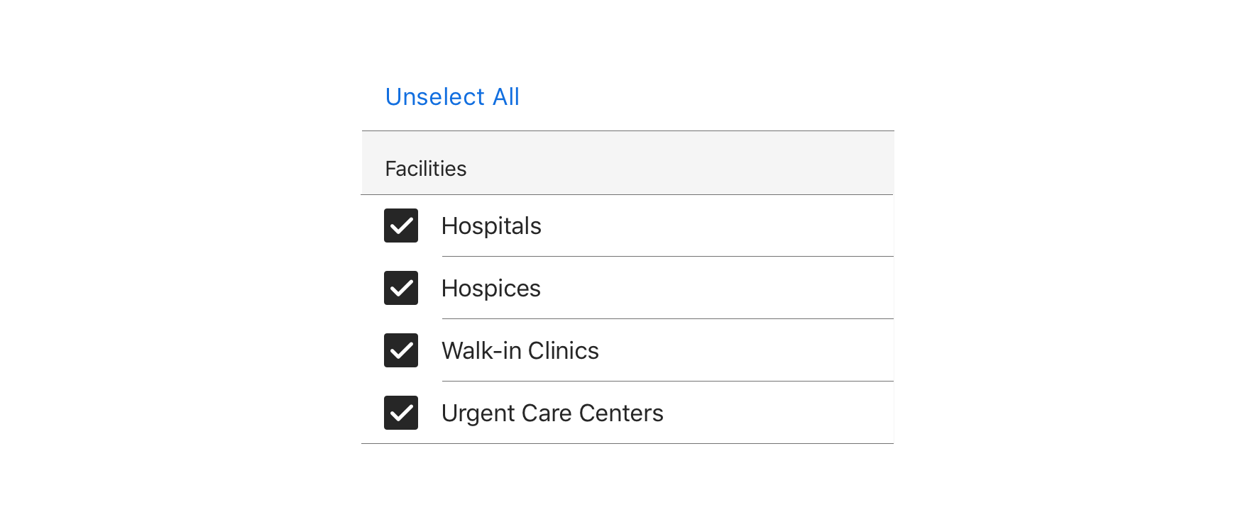
 Checkboxes should operate independently of each other, except when a “Select all”-type option is presented
Visual Style


 Always maintain 44pt minimum hit area for each option
Content Strategy
The overall content goal of Checkbox is to present selections with appropriate scope and style for the screen’s context. A major consideration for the content strategy is whether Checkbox stands alone or appears in a set.
Section Headers
- A standalone Checkbox typically appears within an established section, requiring no additional Section Header
- A set of Checkboxes requires a Section Header to introduce the selections as a whole
- Think of Section Headers as a tone-setter for the content that follows
Grammar & Punctuation
- Selections should follow best practices for capitalization and punctuation. For example, more complex selections should be Sentence case, using end punctuation only if a full sentence.
- Sets, simple and complex, should adhere to parallel syntax
Actions
-
Because Checkbox is inherently selectable, actions are not required to highlight that behavior
-
Instead, use actions to clearly define the selection’s intent— bringing clarity to a standalone Checkbox or better distinguishing selections in a set
Character Count
Checkbox can accommodate multiple lines, but as with all selection-related content, short and sweet options make it easier for users.
Accessibility
Characteristics
- One/multiple Checkboxes can be checked
- Tapping label or icon checks/unchecks the Checkbox
- Label clearly identifies purpose for Checkbox
- Groups of Checkboxes require a Section Header to act as a group label
Keyboard/Focus Expectations
- Enabled and disabled Checkboxes receive visible focus with VoiceOver
- Tap checks/unchecks the Checkbox
Screen Rreader Expectations
- Reading order: “unchecked/checked, {Checkbox label}, {Checkbox group label}, Checkbox”
- If disabled: “unchecked/checked, {Checkbox label}, {Checkbox group label}, Checkbox, dimmed”

