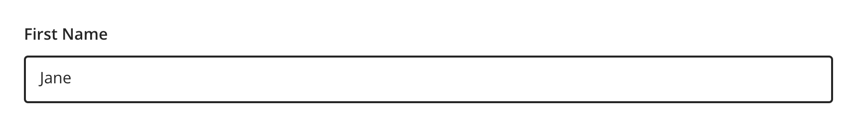
Input
A field, most commonly used in a form, where the user can enter data.
Types
In order for systems to parse data properly, it is important to choose an appropriate option from the available semantic input types. For example, Text input should only be used for basic text information (e.g. Name), not for things like phone numbers or emails.
Note: Currently, the Input component utilizes default web behaviors (with the exception of error handling) and will vary in functionality and style between each browser.
- Telephone
- Number
- Password
- Date
- Time
- Text
An input type that lets the user enter and edit an e-mail address


Telephone
An input type that lets the user edit or enter a telephone number


Number
An input type that lets the user enter and edit a number


Password
An input type that lets the user securely enter a password
Note: Show/hide functionality is coming soon.


Date
An input type that creates input fields and lets users enter a date, either with a text box that validates the input or a special date picker interface.
Note: Never use Date input type for date of birth. Use Text input type instead.


Time
An input type that creates input fields designed to let the user easily enter a time (hours and minutes, and optionally seconds).


Text
An input type that lets the user enter single line text


Variants
Default


With Helper Text


Behavior
Validation
The error icon has an alternative text of “Error” which is accessible to assistive technologies.


Visual Style
Input Types can be variable width and should keep the width to the expected length for the content it’s intended for.

 Never make a full page width Text Input on desktop


 Vertically stack and left align inputs when possible.

 Avoid inputs that horizontally align
Content Strategy
Labels
Labels for Input types are typically direct, putting clarity and brevity over brand voice in most contexts.
Text entry is implied, so omit actions. “First Name” suffices instead of “Add First Name”.
-
Aetna: Use Title case for labels
-
CVS: Use Sentence case for labels
Placeholder, Masking & Helper Text
Placeholder text and input masks are not built into the Text Input component. Instead, use helper text above the field to give guidance, as needed.
Requirements & Errors
Mark optional fields as such. Otherwise fields are assumed required.
- Form views with multiple fields should display “All fields are required unless marked optional”
Accessibility
Concerns
Attribute: maxlength
Users who have low vision or are blind may not know that the max length has been reached in the input field. Most screen readers and other assistive technologies continue to announce the user’s keypress on their keyboard and not that the limit has been reached.
Source: Accessibility Support - Maxlength Attribute
Attribute: title
Use of the title attribute is highly problematic for:
-
People using touch-only devices
-
People navigating with keyboards
-
People navigating with assistive technology such as screen readers or magnifiers
-
People experiencing fine motor control impairment
-
People with cognitive concerns
This is due to inconsistent browser support, compounded by the additional assistive technology parsing of the browser-rendered page. If a tooltip effect is desired, it is better to use a more accessible technique that can be accessed with the above browsing methods.
Source: Mozilla (Firefox) - Title Attribute
Type: Number
Scrolling
“Users can accidentally increase or decrease the number using the scroll wheel on the mouse or the scroll gesture on their trackpad. This feature can be useful when collecting countable data but bad if entering data such as passport numbers.” GOV.UK - Why the GOV.UK Design System team changed the input type for numbers
Characteristics
-
Edit state: Label and helper text must be programmatically connected to Text Input
-
Completed: Valid data entered
-
Error state: Text Input should only show error validation messages after a user has interacted with a particular field
Keyboard/Focus Expectations
-
Pressing the tab key moves focus to the Text Input
-
Clicking Label or field focuses the Text Input
-
Error state announced upon focus and receives focus
Screen Reader Expectations*
-
Reading Order: “{Label Name}, edit text, {Helper text}”
-
Error: “{Label Name}, edit text, {Helper text}, {Error message}”
*Note: This is a general experience expectation, but there are variations in how assistive technology responds on certain browser and screen readers.
Annotations
Every component is built to meet accessibility requirements set out by the Web Content Accessibility Guidelines (WCAG) and many recommendations from reliable primary and secondary research. This means many annotations that you would traditionally have to add have already been accounted for. However, to create the most accessible experience possible, the engineers on your team may still require annotations for the following details, along with other attributes defined in the Enterprise-Input developer documentation:
| EDDS Property | Usage Guidelines | Acceptable Values |
|---|---|---|
inputmode:
EDDS Input:
HTML Output: |
Can hint at the type of data that might be entered by the user while focused on an input, usually by changing the virtual keyboard. Each keyboard may differ by operating system or browser. |
|
pattern
EDDS Input:
HTML Output: |
Adds automatic validation through regular expression to the text, tel, email, url, password, and search input types. |
A valid Javascript regular expression. |
size
EDDS Input:
HTML Output: |
The number of characters that, in a visual rendering, the user agent is to allow the user to see while editing the element's value. |
A valid Javascript regular expression. |
disabled
EDDS Input:
HTML Output: |
The user can neither edit nor focus on the control, nor its form control descendants. |
|
required
EDDS Input:
HTML Output: |
Indicates that the user must specify a value for the input before the owning form can be submitted. Supported by text, search, url, tel, email, date, month, week, time, datetime-local, number, and password input |
|
autocomplete |
Not currently supported due to security concerns. | |