
Button
A common action that can be easily performed with one tap.
Page sections
Types
Default

Primary

Tertiary

Icon-only
Usage
Buttons represent actions, such as submitting data, launching elements, toggling visibility, etc.
Overview
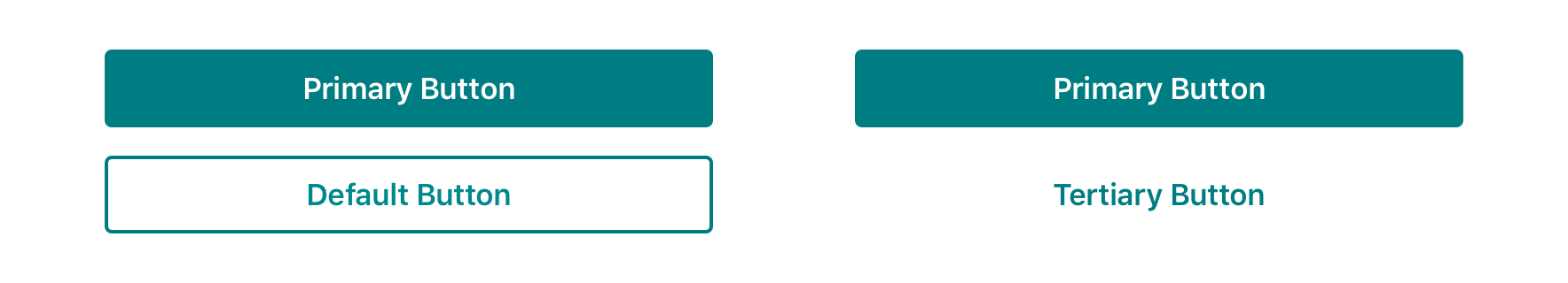
- Default Button: Used for general actions in a view or in a section
- Primary Button: Used to call attention to the main action of the view or large section. Though it should generally be used only once per view, Primary Buttons can be used multiple times if representing parallel primary actions, such as “Add to cart.”
- Tertiary Button: Used for subtle actions on a view or in a section that are not a priority
- Icon-Only Button: Used for actions that can be commonly identified without words, such as “Share”
Button order
Primary actions should generally be presented first within a group of buttons.
Most directional patterns on iOS utilize the navigation bar where “Back” is in the top left and “Next” is in the top right. However, an Anatomy Primary Button can also be used when needing to call attention to directional actions.
 Primary Button can be used to call more attention to the progressive action instead of the navigation bar system button
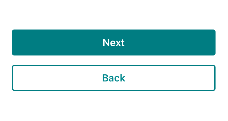
 Avoid vertical stacked buttons for directional navigation
For scenarios that require directional buttons in a horizontal group, the button type layout should appear in a more natural order.

Button groups
Use button groups when you are presenting multiple priorities or emphasis.
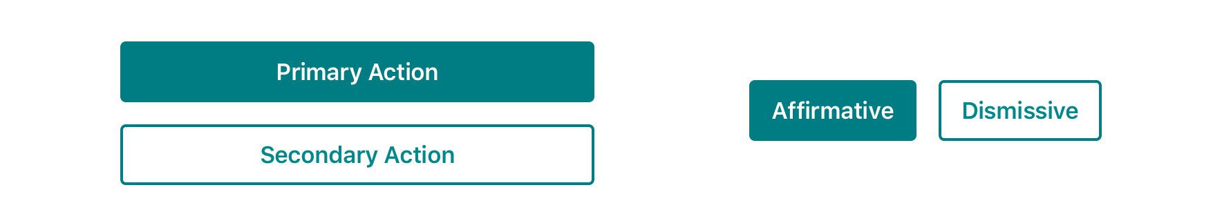
 For button groups that have multiple priorities, use Primary along with Default or Tertiary Buttons pending on emphasis. These buttons usually perform complimentary actions
Similar priorities
 For actions that have similar priorities, group either Default Buttons or Tertiary Buttons together
 Avoid grouping Primary buttons together
 Icon-Only Buttons can be grouped together
 Avoid using Icon-Only Buttons extensively for numerous actions
Width
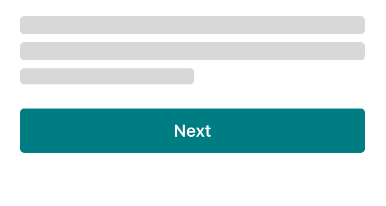
Buttons will generally be full-width of the view or parent container with minimum 16pt margins.

Buttons may support variable width based on label length for specific scenarios that may require a smaller CTA. Considerations of label length should be accounted for in addition to minimum touch target, which is 44pt x 44pt.

Behavior
Loading
Sometimes a Button represents an action whose completion doesn’t immediately occur. In such cases, Button has a loading state that communicates the action is still underway.

Visual Style
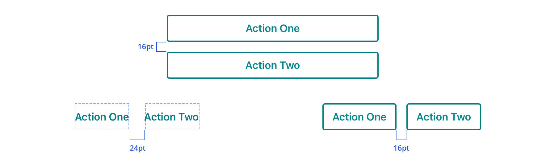
 Buttons should have a minimum of 16pt margin above and below in relation to other content
 Avoid long labels, which may truncate
Content strategy
- Use Title Case
- Lead with a verb
- Aim for short actions, around 1-4 words
- Use simple global commands when possible: Save, Back, Next, Apply, etc.
- Add specificity with purpose (e.g. “Assign as Primary Care Physician” brings necessary meaning to the action, compared to the shorter “Assign”)
- Accessibility Hint added when action label doesn’t provide enough context. (Example: {Button Label}, “Confirm Quantity”, Accessibility Hint “double tap to confirm amount and review order ”)
Accessibility
Characteristics
- Performs actions such as submitting a form, opening a dialog, cancelling an action, or performing a command such as inserting a new record or displaying information
- Button Labels will default to centered alignment when single line, and will display left aligned when wrapped for improved legibility
Focus expectations
- Focus stays on button until action is performed
- Following button activation, focus is set depending on the type of action the button performs
Screen reader expectations
- “{Button Label}, button”
- Disabled state: “{Button Label}, dimmed, button”
- Icons don’t receive focus since they are decorative