Colors
Color is designed to help communicate our CVS Health brands and unify experiences across all digital products.
Palette
Colors provided in this palette have been carefully chosen to ensure we meet WCAG requirements for optimal usability and minimum contrast ratio requirements for text and interactive elements.
Our color palette extends the base colors in our brand to ensure enough contrast can be met. When combining palette colors together, check the contrast ratios of the color combinations utilizing these accessibility approved tools.
(b) = contrast ratio on black (w) = contrast ratio on white
| Scale | Hex Code | Contrast Ratio |
|---|---|---|
| 0 | #fbf2ff | 19.24:1 (b) |
| 10 | #f4d9ff | 16.21:1 (b) |
| 20 | #e3aafa | 11.39:1 (b) |
| 30 | #cb87e8 | 8.17:1 (b) |
| 40 | #b569d6 | 5.95:1 (b) |
| 50 | #a05cbd | 4.76:1 (b) |
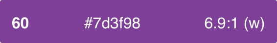
| Base60 | #7d3f98 | 6.9:1 (w) |
| 70 | #64327a | 9.21:1 (w) |
| 80 | #4d295e | 11.7:1 (w) |
| 90 | #392042 | 14.39:1 (w) |
| 100 | #221726 | 17.23:1 (w) |
| Scale | Hex Code | Contrast Ratio |
|---|---|---|
| 0 | #f2ffff | 20.5:1 (b) |
| 10 | #c2fdff | 18.8:1 (b) |
| 20 | #7cdbde | 13.0:1 (b) |
| 30 | #48c3c7 | 9.9:1 (b) |
| 40 | #21b0b5 | 7.9:1 (b) |
| 50 | #0c979c | 5.9:1 (b) |
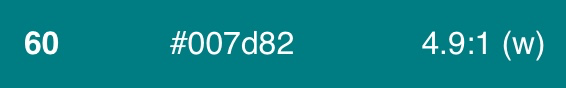
| Base60 | #007d82 | 4.9:1 (w) |
| 70 | #026569 | 6.8:1 (w) |
| 80 | #054d4f | 9.6:1 (w) |
| 90 | #093233 | 13.9:1 (w) |
| 100 | #0c2526 | 16.1:1 (w) |
| Scale | Hex Code | Contrast Ratio |
|---|---|---|
| 0 | #f5f5f5 | 19.3:1 (b) |
| 10 | #dedede | 15.6:1 (b) |
| 20 | #cccccc | 13.1:1 (b) |
| 30 | #b8b8b8 | 10.6:1 (b) |
| 40 | #a3a3a3 | 8.3:1 (b) |
| 50 | #8f8f8f | 6.5:1 (b) |
| Base60 | #737373 | 4.7:1 (w) |
| 70 | #575757 | 7.2:1 (w) |
| 80 | #474747 | 9.3:1 (w) |
| 90 | #333333 | 12.6:1 (w) |
| 100 | #262626 | 15.1:1 (w) |
| Scale | Hex Code | Contrast Ratio |
|---|---|---|
| 0 | #fff2f2 | 19.2:1 (b) |
| 10 | #ffd9d9 | 16.2:1 (b) |
| 20 | #ffb3b3 | 12.4:1 (b) |
| 30 | #ff8c8c | 9.4:1 (b) |
| 40 | #fa5757 | 6.6:1 (b) |
| 50 | #eb0000 | 4.6:1 (w) |
| Base60 | #cc0000 | 5.9:1 (w) |
| 70 | #a50000 | 8.1:1 (w) |
| 80 | #730b0b | 11.8:1 (w) |
| 90 | #4d0f0f | 15.1:1 (w) |
| 100 | #260b0b | 18.5:1 (w) |
| Scale | Hex Code | Contrast Ratio |
|---|---|---|
| 0 | #f5f5f5 | 19.3:1 (b) |
| 10 | #dedede | 15.6:1 (b) |
| 20 | #cccccc | 13.1:1 (b) |
| 30 | #b8b8b8 | 10.6:1 (b) |
| 40 | #a3a3a3 | 8.3:1 (b) |
| 50 | #8f8f8f | 6.5:1 (b) |
| Base60 | #737373 | 4.7:1 (w) |
| 70 | #575757 | 7.2:1 (w) |
| 80 | #474747 | 9.3:1 (w) |
| 90 | #333333 | 12.6:1 (w) |
| 100 | #262626 | 15.1:1 (w) |
Usage
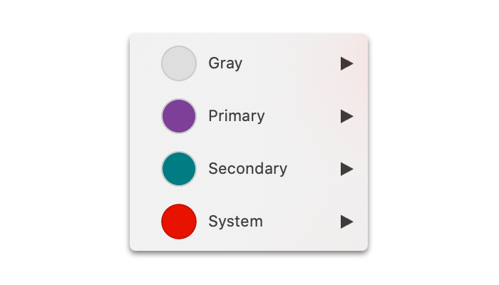
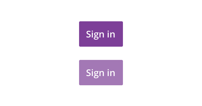
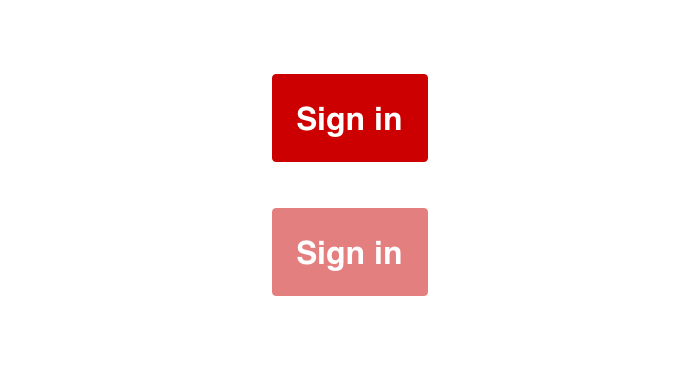
Primary
Primary color is used distinguish CVS brand across digital products and emphasize important actions.
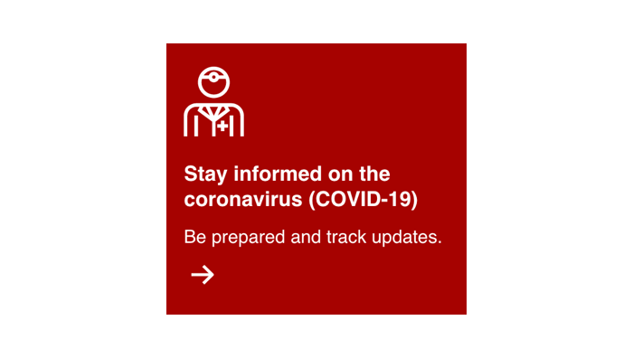
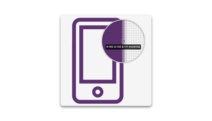
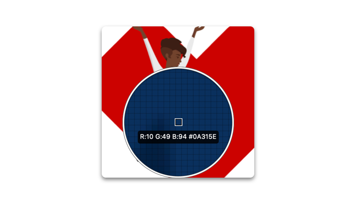
Red
Violet


Secondary
Coming soon
Secondary color is used as an augmentation to primary color. Always use the base color unless contrast requirements can not be met.
Teal

Grayscale
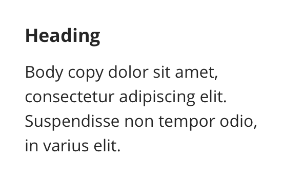
Gray is the default, neutral color of our UI and represents the basis of most atomic components. Examples include text, form elements, backgrounds, page dividers.
Gray


Guidelines
Following these general guidelines for color will ensure meaning and consistency across all digital products.
Using Color Ramps
Color ramps have been carefully chosen for accessibility and ensure consistency across all digital products.
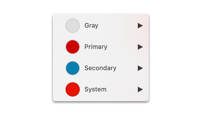
 Always use color provided in the UI Kit to ensure consistency
 Avoid creating your own color. This will lead to inconsistency in the UI
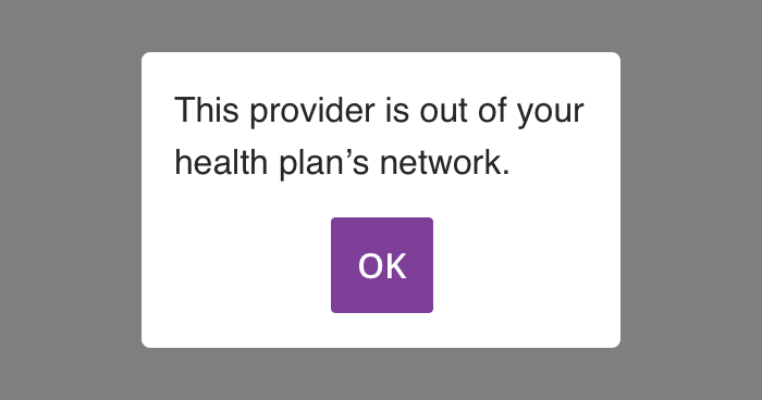
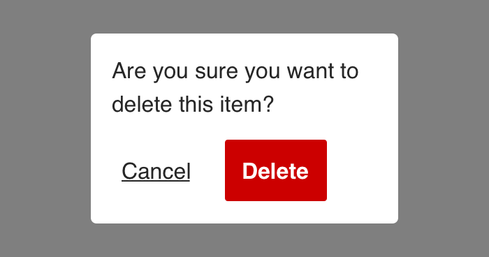
Communication
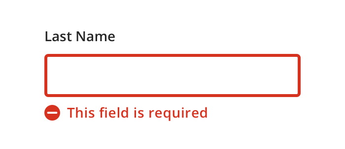
 Icons with messaging help users understand the level of importance
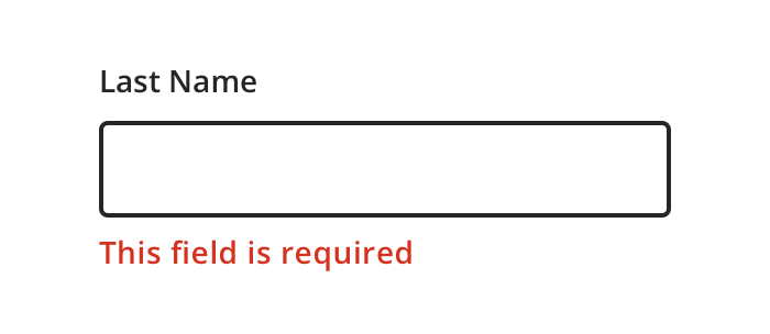
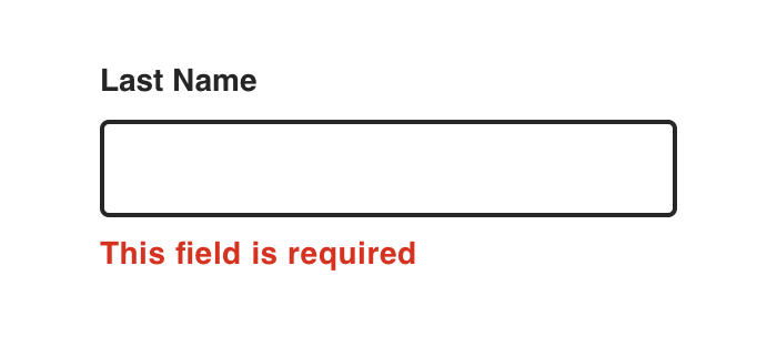 Avoid using color as the only way to indicate meaning
Transparency
All colors should be opaque unless transparency is needed for specific elements (e.g. overlays and drop shadows).
 Always use transparency for it’s intended purpose
 Never use transparency to simulate a lighter or darker color