Grid
Grid guidelines to ensure layouts are consistent across all Enterprise Digital products.
Note
Currently, EDDS does not offer a Grid framework. It is the responsibility of the product team to build layout, using EDDS Grid and Spacing best practices.
Types
There are two types of grids that can be used for layout depending on your content needs.
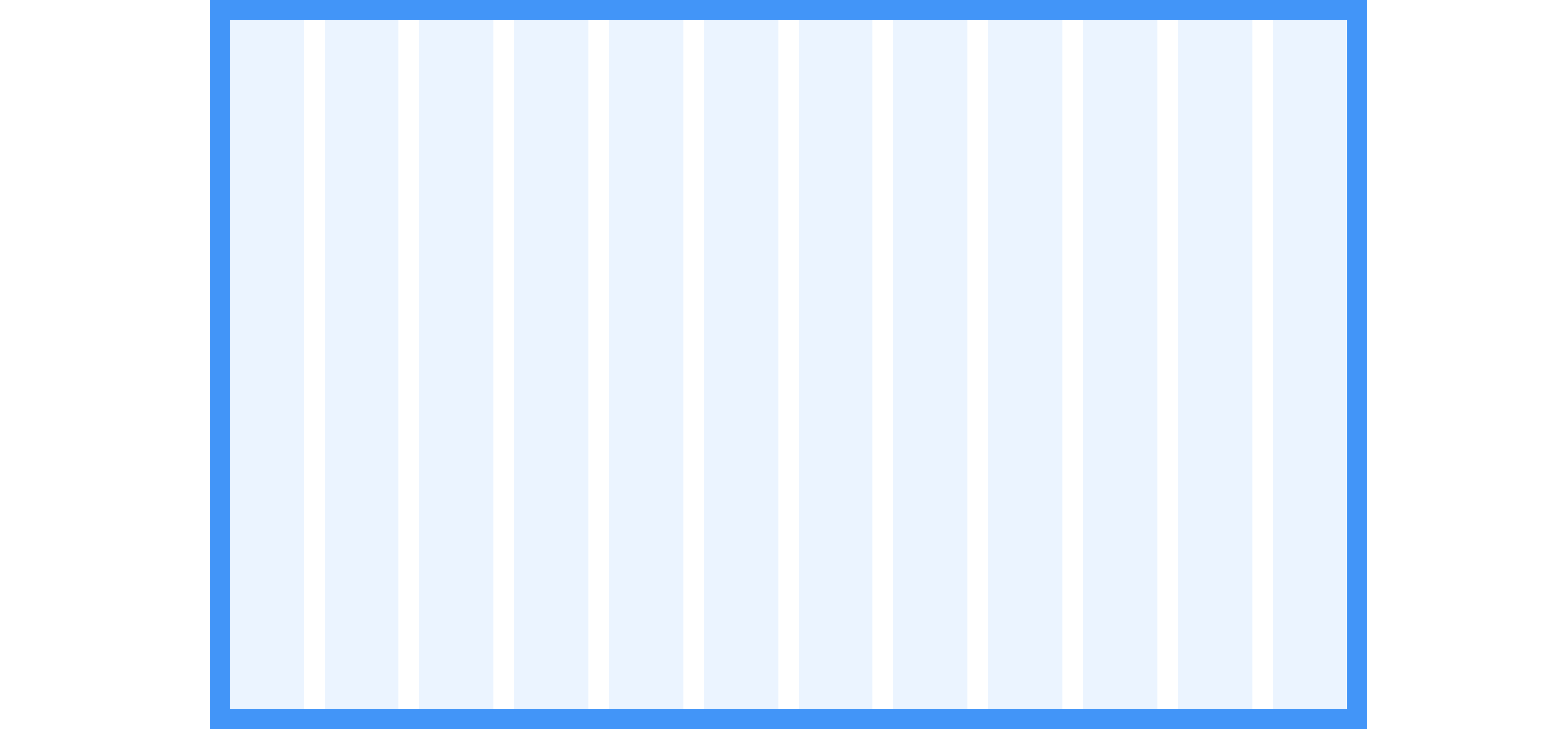
Fixed-Width
In a Fixed-Width Grid, a maximum width is determined. Columns within a Fixed-width Grid are fluid and depending on the breakpoint range, the number of columns available will change.
Fixed-width layouts are very common across the web and are typically used for layouts like landing pages, informational pages or layouts that don’t need to fill up the space for optimal use.


| Viewport Width | Columns | Grid Container Max-width |
|---|---|---|
| Less than 768px (48rem) | 4 | 100% |
| 768 - 1024 | 8 | 100% |
| Greater than 1024px (64rem) | 12 | 1280px (80rem) |
Full-Width
Full-width Grids expand 100% of the viewport. Columns within a Full-width Grid are fluid and depending on the breakpoint range, the number of columns available will change.
Common Full-width layouts are dashboards, portfolios, or any layout that is content heavy and needs to make use of the whole space.


| Viewport Width | Columns | Grid Container Width |
|---|---|---|
| Less than 768px (48rem) | 4 | 100% |
| 768 - 1024 | 8 | 100% |
| Greater than 1024px (64rem) | 12 | 100% |
Visual Style
Grid Margins
Grid margins are units expressed as top, right, bottom and left margins that surround the perimeter of a grid’s container.

| Viewport Width | Margin Top | Margin Right | Margin Bottom | Margin Left |
|---|---|---|---|---|
| Less than 768px (48rem) | 24px (1.5rem) | 16px (1rem) | 24px (1.5rem) | 16px (1rem) |
| 768 - 1024 | 32px (2rem) | 24px (1.5rem) | 32px (2rem) | 24px (1.5rem) |
| Greater than 1024px (64rem) | 48px (3rem) | 24px (1.5rem) | 48px (3rem) | 24px (1.5rem) |
Gutters
Gutters are spacing between columns and are expressed as margin values (not padding). We have provided a list of suggested spacing for gutters however, they can be modified to accommodate your content using the units provided in the Spacing guidelines.
Note
If items are interactive, they should maintain, at least, a total of 16px spacing between for optimal touch target spacing.

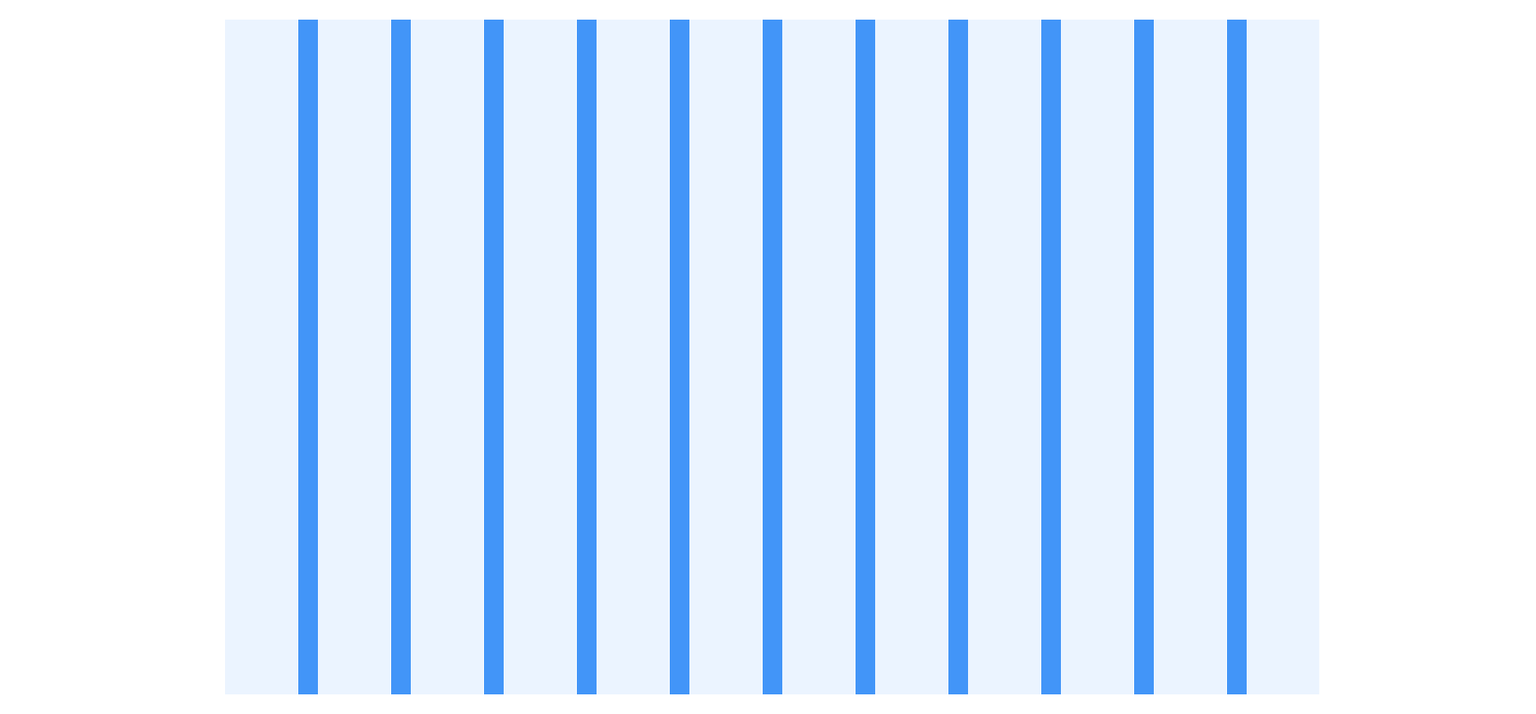
| Viewport Width | Gutter |
|---|---|
| Less than 768px (48rem) | 16px (1rem) |
| 768 - 1024 | 16px (1rem) |
| Greater than 1024px (64rem) | 24px (1.5rem) |
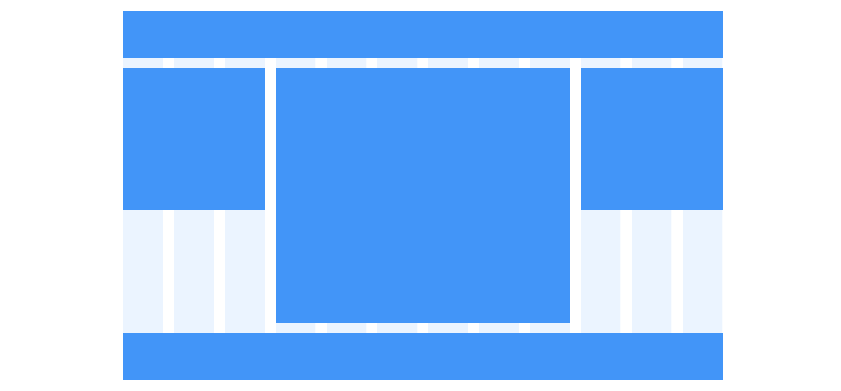
Content Regions
Content regions are separated by gutters and can span several columns.

Content Spacing
For information on how to space content within a content region, view our Spacing guidelines.
Usage
Column Spanning
Content regions can span single or multiple columns. Each content region must span to the edge of a grid column.


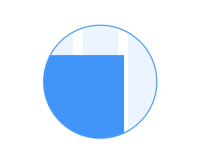
 Never overlap gutters with content regions.

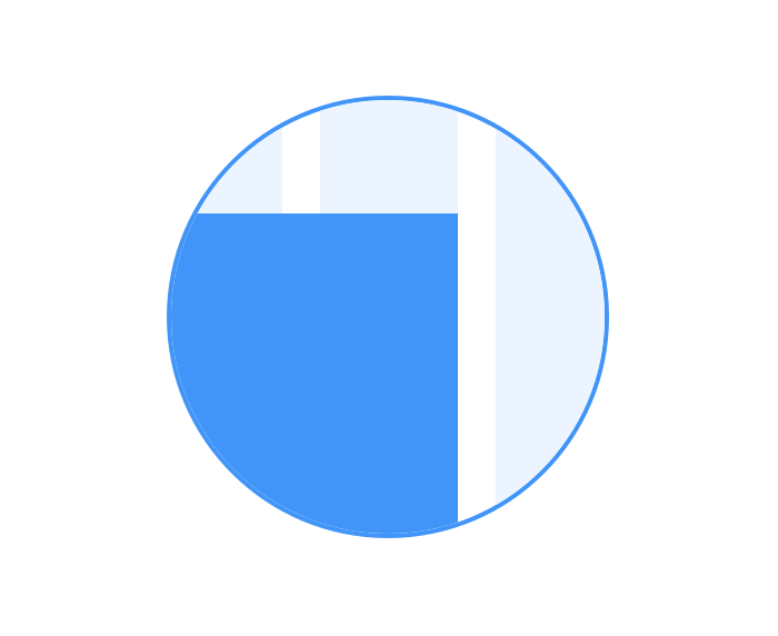
 Always span content regions to the edge of a column.
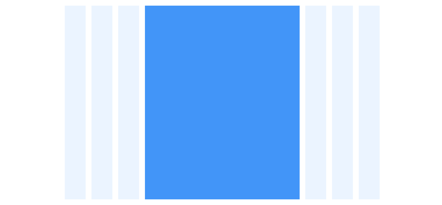
Offsetting
Content regions don’t have to span the full amount of columns available, they can be offset for content regions that need to occupy a smaller max-width.
For example, copy has optimal readability at 50-75 characters across. Because of this, you could offset the content region to center and span six columns.

Behavior
Scrolling
It is required that content be presented without loss of information or functionality, and without forcing the user to scroll in two directions for:
Vertical scrolling content at a (minimum) width equivalent to 320 CSS pixels,
Horizontal scrolling content at a (minimum) height equivalent to 256 CSS pixels.
The exception to this is content which requires vertical and horizontal scrolling for usage or meaning. An example would be a data table.
Responsive Reflow
When content adapts to the user’s browser, device, or preferences, it is important to make sure the visual order always matches the source code order of the content. This helps to provide Meaningful Sequence and provide an intuitive Focus Order.
Example
Elements A and B are rendered visually in the same order as the source code.

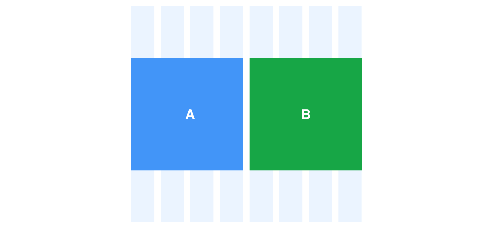
The user changes the orientation on their device and block A and B switch order, which conflicts with the source code.

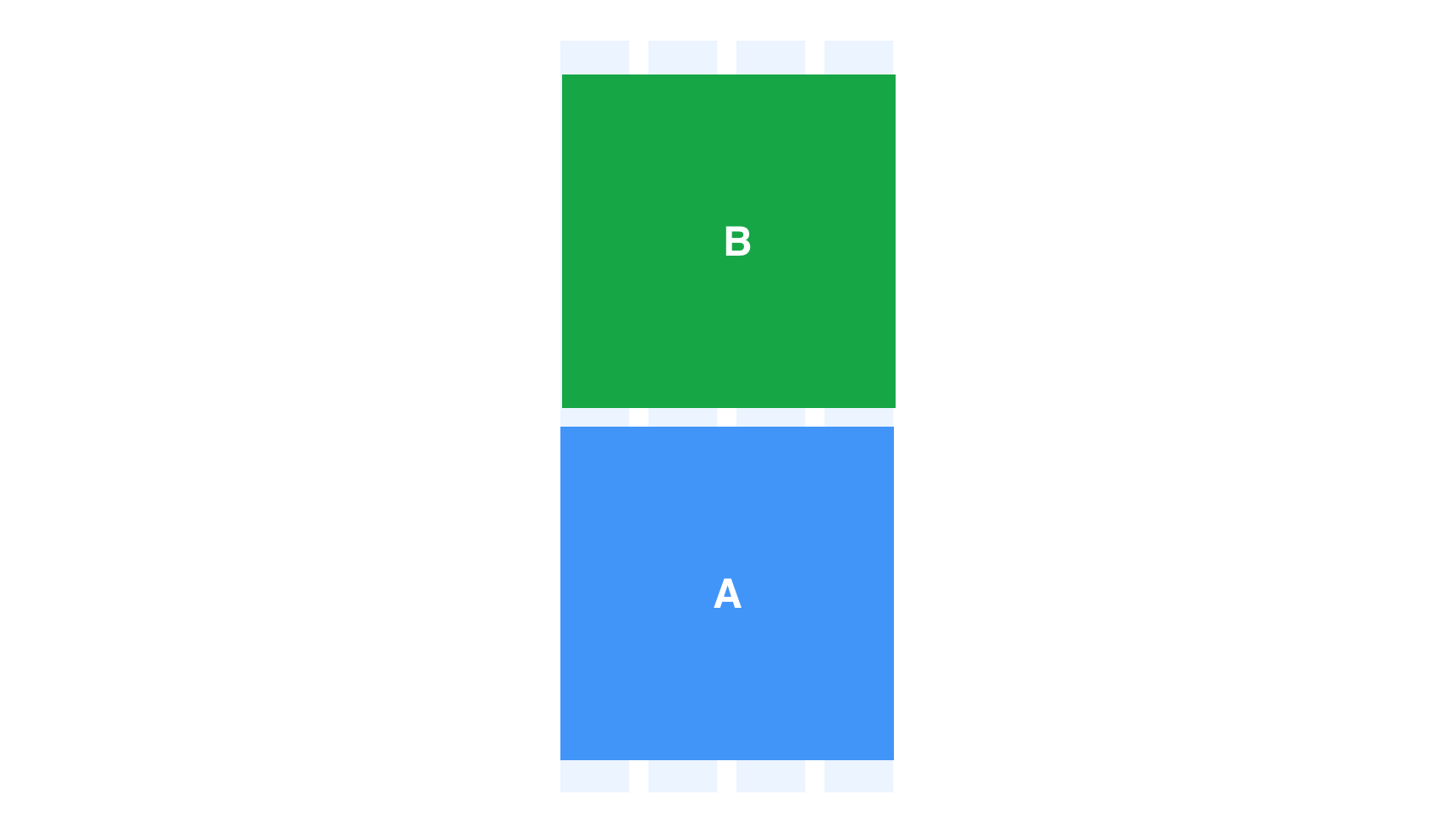 Never change the visual and source code order across different views.
The user changes orientation on their device and elements A and B continue to render visually the same as the source code order.

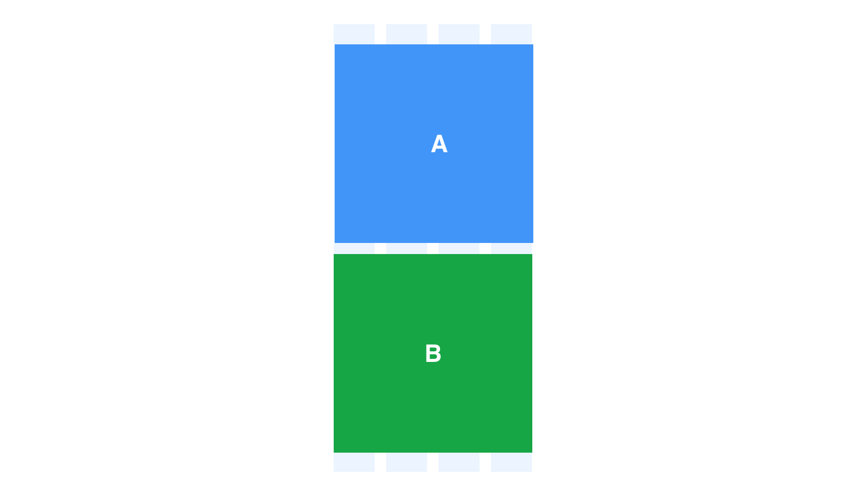 The visual and source code order should always match across all views.