Typography
Enterprise Digital typographic styles
Type styles that have been carefully chosen for consistency and optimal readability across Enterprise Digital products. For information on how to structure typography semantically, scroll down to the “Usability Guidelines“ section within this page.
(Web) Typeface
| Type Face | Available Weights |
|---|---|
| Helvetica | Regular, Bold |
| Type Face | Available Weights |
|---|---|
| Domaine Display | Bold |
| Open Sans | Regular, Semibold, Bold |
(Web) Font stack
| Type Face | Font Stack |
|---|---|
| Helvetica | Helvetica, Arial, Sans Serif; |
| Type Face | Font Stack |
|---|---|
| Domain Display | ‘Domaine Display’, Georgia, Serif; |
| Open Sans | ‘Open Sans’, Arial, Sans-Serif; |
(Web) Type Styles - Screen sizes > 1024px
Web platform type styles for screens greater than 1024px
| Style Name | Size (rem) | Size (px) | Line Height (em) | Line Height (px) | Weight |
|---|---|---|---|---|---|
Display Heading |
2.25 | 36 | 1.3 | 46.8 | Bold |
Display Sub Heading |
1.5 | 24 | 1.3 | 31.2 | Bold |
Heading (XL) |
1.75 | 28 | 1.3 | 36.4 | Bold |
Sub Heading (XL) |
1.25 | 20 | 1.3 | 26 | Bold |
Heading (L) |
1.375 | 22 | 1.3 | 28.6 | Bold |
Sub Heading (L) |
1 | 16 | 1.3 | 20.8 | Bold |
Heading (M) |
1.125 | 18 | 1.3 | 23.4 | Bold |
Heading (S) |
1 | 16 | 1.3 | 20.8 | Bold |
Heading (XS) |
0.875 | 14 | 1.3 | 18.2 | Bold |
Body (M) |
1 | 16 | 1.5 | 24 | Regular |
Body (S) |
0.875 | 14 | 1.5 | 21 | Regular |
Body (XS) |
0.75 | 12 | 1.5 | 18 | Regular |
| Style Name | Size (rem) | Size (px) | Line Height (em) | Line Height (px) | Weight |
|---|---|---|---|---|---|
Display Heading |
2.25 | 36 | 1.3 | 46.8 | Bold |
Display Sub Heading |
1.5 | 24 | 1.3 | 31.2 | Semibold |
Heading (XL) |
1.75 | 28 | 1.3 | 36.4 | Bold |
Sub Heading (XL) |
1.25 | 20 | 1.3 | 26 | Semibold |
Heading (L) |
1.375 | 22 | 1.3 | 28.6 | Bold |
Sub Heading (L) |
1 | 16 | 1.3 | 20.8 | Semibold |
Heading (M) |
1.125 | 18 | 1.3 | 23.4 | Bold |
Heading (S) |
1 | 16 | 1.3 | 20.8 | Bold |
Heading (XS) |
0.875 | 14 | 1.3 | 18.2 | Bold |
Body (M) |
1 | 16 | 1.5 | 24 | Regular |
Body (S) |
0.875 | 14 | 1.5 | 21 | Regular |
Body (XS) |
0.75 | 12 | 1.5 | 18 | Regular |
(Web) Type Styles - Screen Sizes < 1024px
Web platform type styles for screens less than 1024px
| Style Name | Size (rem) | Size (px) | Line Height (em) | Line Height (px) | Weight |
|---|---|---|---|---|---|
Display Heading |
2 | 32 | 1.3 | 41.6 | Bold |
Display Sub Heading |
1.375 | 22 | 1.3 | 28.6 | Bold |
Heading (XL) |
1.625 | 26 | 1.3 | 33.8 | Bold |
Sub Heading (XL) |
1.25 | 20 | 1.3 | 26 | Bold |
Heading (L) |
1.375 | 22 | 1.3 | 28.6 | Bold |
Sub Heading (L) |
1.125 | 18 | 1.3 | 23.4 | Bold |
Heading (M) |
1.25 | 20 | 1.3 | 26 | Bold |
Heading (S) |
1.125 | 18 | 1.3 | 23.4 | Bold |
Heading (XS) |
1 | 16 | 1.3 | 20.8 | Bold |
Body (M) |
1.125 | 18 | 1.5 | 27 | Regular |
Body (S) |
1 | 16 | 1.5 | 24 | Regular |
Body (XS) |
0.875 | 14 | 1.5 | 21 | Regular |
| Style Name | Size (rem) | Size (px) | Line Height (em) | Line Height (px) | Weight |
|---|---|---|---|---|---|
Display Heading |
2 | 32 | 1.3 | 41.6 | Bold |
Display Sub Heading |
1.375 | 22 | 1.3 | 28.6 | Semibold |
Heading (XL) |
1.625 | 26 | 1.3 | 33.8 | Bold |
Sub Heading (XL) |
1.25 | 20 | 1.3 | 26 | Semibold |
Heading (L) |
1.375 | 22 | 1.3 | 28.6 | Bold |
Sub Heading (L) |
1.125 | 18 | 1.3 | 23.4 | Semibold |
Heading (M) |
1.25 | 20 | 1.3 | 26 | Bold |
Heading (S) |
1.125 | 18 | 1.3 | 23.4 | Bold |
Heading (XS) |
1 | 16 | 1.3 | 20.8 | Bold |
Body (M) |
1.125 | 18 | 1.5 | 27 | Regular |
Body (S) |
1 | 16 | 1.5 | 24 | Regular |
Body (XS) |
0.875 | 14 | 1.5 | 21 | Regular |
(Web) Style Mapping
Mapping existing Web platform, legacy type styles to new EDDS type styles
| Style Name | CVS |
|---|---|
Display Heading |
H Level 1 |
Display Sub Heading |
|
Heading (XL) |
H Level 2 |
Sub Heading (XL) |
|
Heading (L) |
H Level 3 |
Sub Heading (L) |
|
Heading (M) |
H Level 4 |
Heading (S) |
|
Heading (XS) |
|
Body (M) |
Paragraph, Default UI |
Body (S) |
Disclaimer |
Body (XS) |
| Style Name | Aetna |
|---|---|
Display Heading |
Display Headline |
Display Sub Heading |
|
Heading (XL) |
Page Headline |
Sub Heading (XL) |
|
Heading (L) |
Section Headline |
Sub Heading (L) |
|
Heading (M) |
|
Heading (S) |
|
Heading (XS) |
|
Body (M) |
Body, Numeral, Disclaimer label, Label, Link, CTA |
Body (S) |
Body (Small), Numeral (Small), Disclaimer Label (Small), Link (Small) |
Body (XS) |
Badge |
(Android & iOS) Type Styles
Both iOS and Android platforms use a different type scale than web and mobile web platform. By using their native type scales, you are ensuring the experiences, you design and build, adhere to accessibility to correct aspect ratio sizing as well as accessibility features within that platform.
Note: Enterprise Digital Design System team are evaluating native type styles and deciding how they can fit into EDDS type system.
Usability Guidelines
Text Formatting


 Never use all caps unless it’s for acronyms or initials.

 Avoid using Italics to emphasize words.


 Underlines are reserved for links only.
Color

 Do not use color to convey hierarchy.

 Always use A11y approved Grayscale colors and rely on weight and size to distinguish text hierarchy.
Size

 Avoid using fonts smaller than 14px (0.875 rem).

 Only use percentage based units (rem) so users are still able to adjust font size on their devices.
Always declare line height as a percentage based unit (em), relative to it’s current font size.
Only use percentage based units (rem) so users are still able to adjust font size on their devices.
Always declare line height as a percentage based unit (em), relative to it’s current font size.
Breakpoints
Do not use fluid typography. It can override a users default font size on their device. Stick to adaptive media queries instead.
Headings
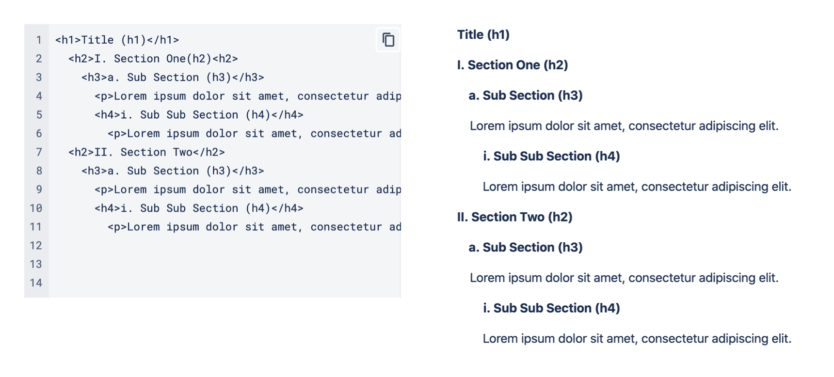
Users who need screen readers rely on well structured headings to navigate content. Always make sure to use the correct level of HTML heading tags.
The <h1> tag can only be used once and at the highest level of the page, usually to indicate the page title. All other HTML heading tags can be used multiple times but must follow a hierarchy. The best way to structure heading levels is similar to an outline.
Never skip heading levels, this can cause confusion for users and prevent websites from being navigated properly by screen readers and search engines.