
Button
A common action that can be easily performed with one click or tap.
Page sections
Types
Default

Primary

Tertiary

Icon-Only
Usage
Buttons represent actions, such as submitting data, launching elements, toggling visibility, etc. If navigating to a different site or page, a link should be used.
Overview
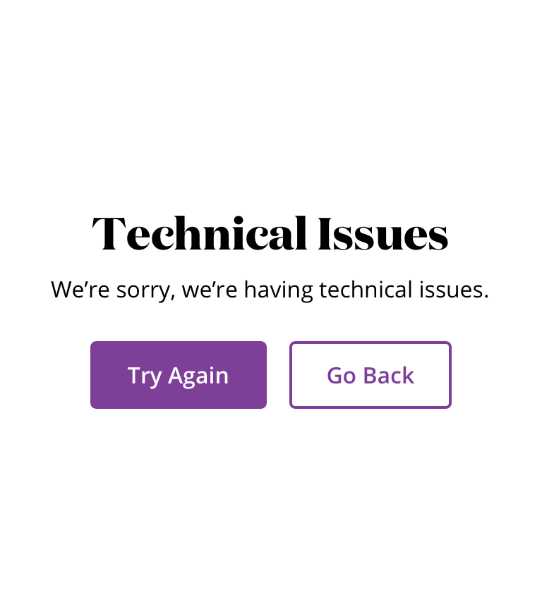
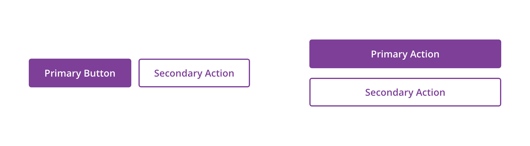
- Default Button: Used for general actions on a page or in a section
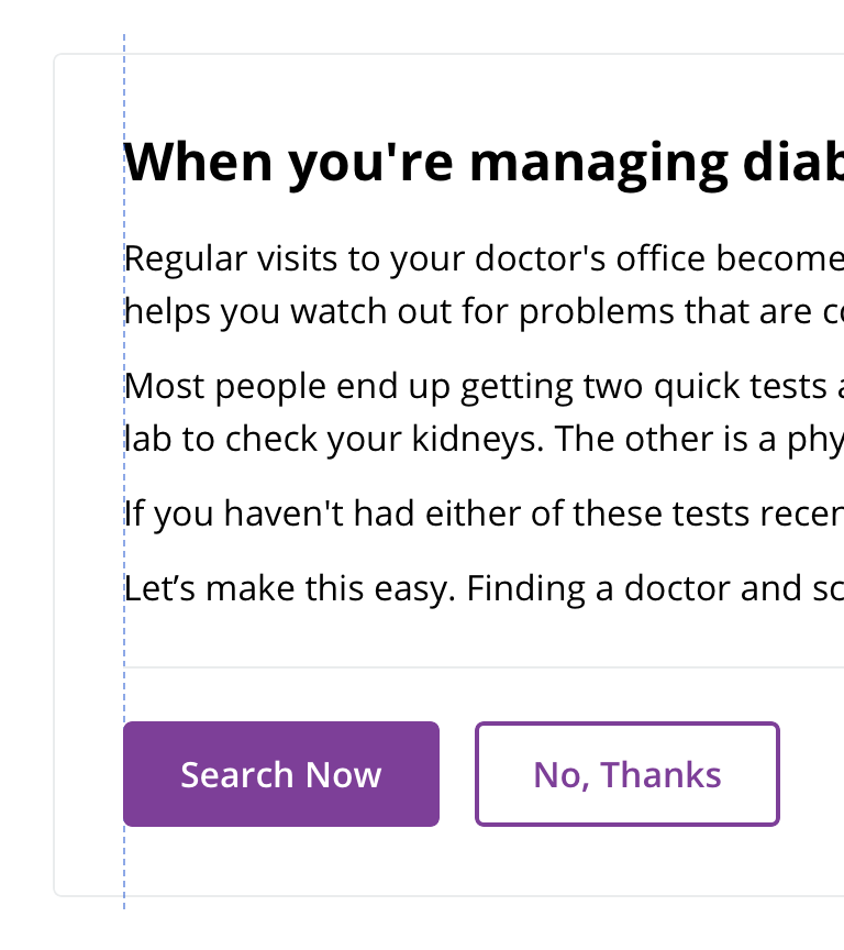
- Primary Button: Used to call attention to the main action of the page or large section. Though it should generally be used only once per page, Primary Buttons can be used multiple times if representing parallel primary actions, such as “Add to Cart.”
- Tertiary Button: Used for subtle actions on a page or in a section that are not a priority
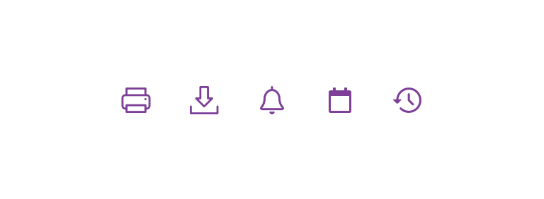
- Icon-only Button: Used for actions that can be commonly identified without words, such as “Print”
Alignment
To maximize usability and accessibility, Buttons should generally align to the content with which they’re associated.
 Content that is left aligned should have left-aligned buttons
 Content that is centered should have centered buttons
 Buttons can be in-line with list items they are associated with
Primary Button order
Primary actions should generally be presented first within a group of buttons.
Directional buttons, however, don’t follow the “Primary first” rule and should appear in a more natural order.

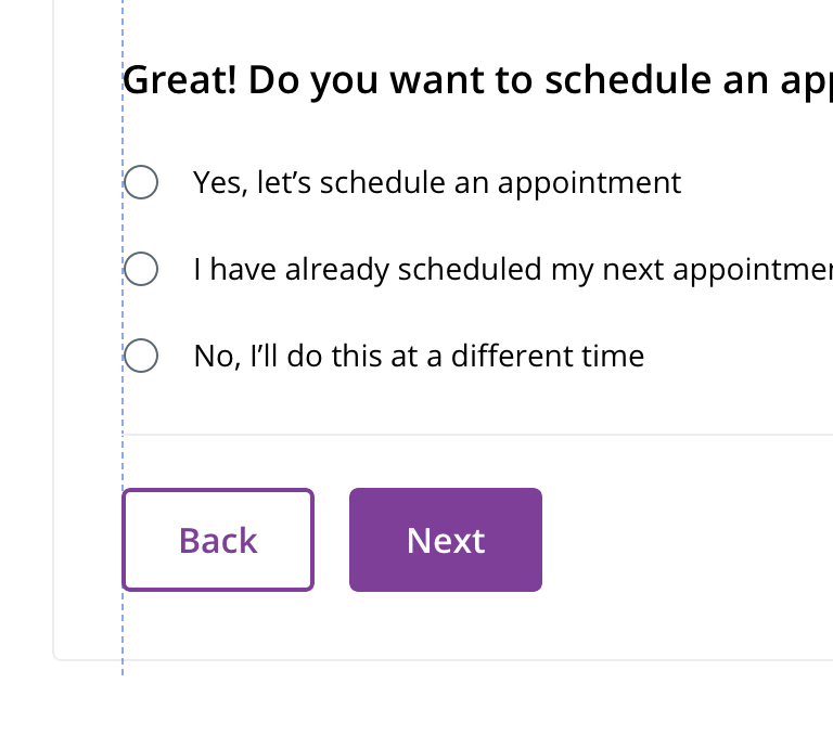 On desktop, directional buttons follow spacing guidelines and align with the content
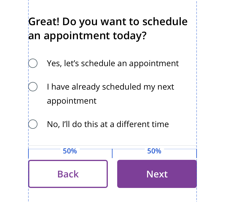 On mobile and in smaller-width containers (e.g. Right Drawer), directional buttons should fit 50/50 in the container space

 Avoid stacking directional buttons as this removes the left and right association with these actions
Button groups
Multiple priorities
 For button groups that have multiple priorities, use Primary and Default Buttons. These buttons usually perform complimentary actions.
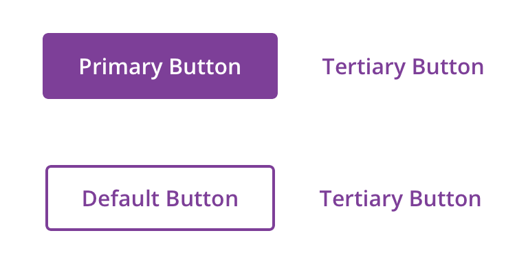 Avoid using a Tertiary Button with Default or Primary Buttons
Avoid using a Tertiary Button with Default or Primary Buttons
Avoid using a Tertiary Button with Default or Primary Buttons
Similar priorities
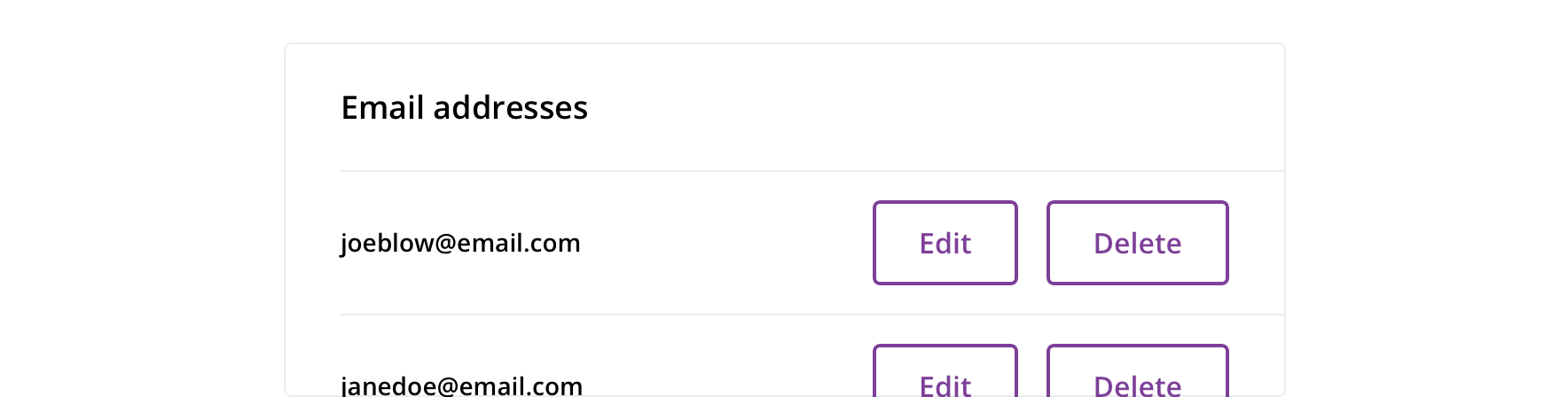
 For actions that have similar priorities, group either Default Buttons or Tertiary Buttons together
 Avoid grouping Primary Buttons together
 Icon-Only Buttons can be grouped together
 Avoid using Icon-Only Buttons extensively for numerous actions
Full-width
Primary and Default Buttons should generally be full-width on mobile. On desktop, they also be full-width if they’re within small content regions.

Behavior
Loading
Sometimes a Button represents an action whose completion doesn’t immediately occur. In such cases, Button has a loading state that communicates the action is still underway.

Visual style
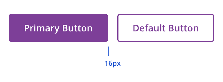
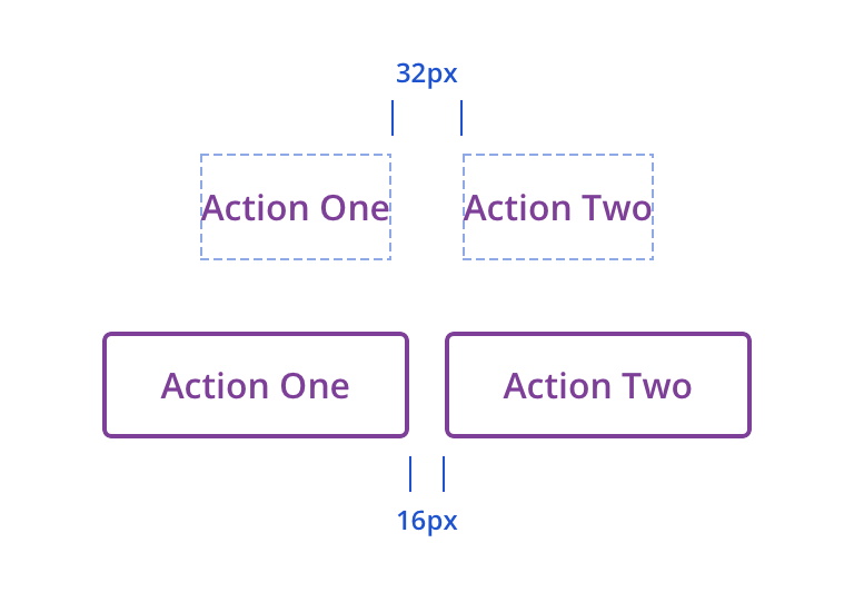
 Buttons should have a minimum of 16px above and below in relation to other content
 Avoid wrapping a button to two lines
Content strategy
- Use Title Case for labels
- Try to keep labels short, around 1-4 words
- Lead with a verb
- Add specificity with purpose (e.g. “Search Physicians” serves a direct purpose by orienting the user)
- Use simple global commands when possible: Save, Back, Next, Apply, etc.
Accessibility
Characteristics
- All enabled and hover states pass WCAG AA contrast
- Disabled states do not need to pass WCAG AA contrast guidelines, however, our disabled buttons have about 20% more contrast than the average disabled button
- All Button types have a default height of 48px to account for touch target sizes on touch screens
Keyboard/focus expectations
- Enabled Button receives screen reader and tab focuses
- Disabled Button receives screen reader focus and tab focus
- Activates using Enter or Spacebar
- Watch State: Focus shifts to ARIA live region after Button is activated and remains there until action is performed or error message is displayed
Screen reader expectations
If using Button as a Button, Name, Role, and State (if applicable) will be announced when Button receives focus. For example, if the Button label is “Assign Physician,” the button will read out: Assign Physician, button. If the Button has a State, such as disabled or in a watch state, the state will be read out at the end, for example: Assign Physician, button, disabled.
A description (if applicable) can be added and announced when button receives focus. For example: Assign Physician, button, assigning a physician will replace any previously assigned physician.
Watch states:
- Use
aria-live="polite"on the<button> - Focus stays on the Button until script finishes processing and the user is taken to the next appropriate element