
Skeleton
Used to provide a more elegant transition from a loading state to loaded content by indicating to the user a general sense of what type of content will be presented.
Page sections
Types
Text Lines

Circle List

Header Group

Circle Detail Group

Tabs

Table
Custom


Usage
- Use on initial page load or if a majority of the page structure is changing
- Don’t use for every single UI element and instead convey the general types of content that will be shown
- Don’t use for buttons
- When representing lists of data where the number of items isn’t known, use at least six items
- Don’t use for photography, but instead consider a solid background of #CACBCC
- Avoid using for Modals, especially when a limited amount of the data is changing. Use a Spinner instead.
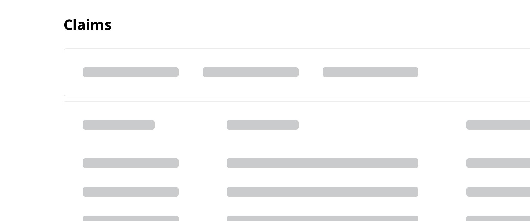
 For pages with titles that are hard-coded, such as a landing page for claims, display the page title outside of the skeleton
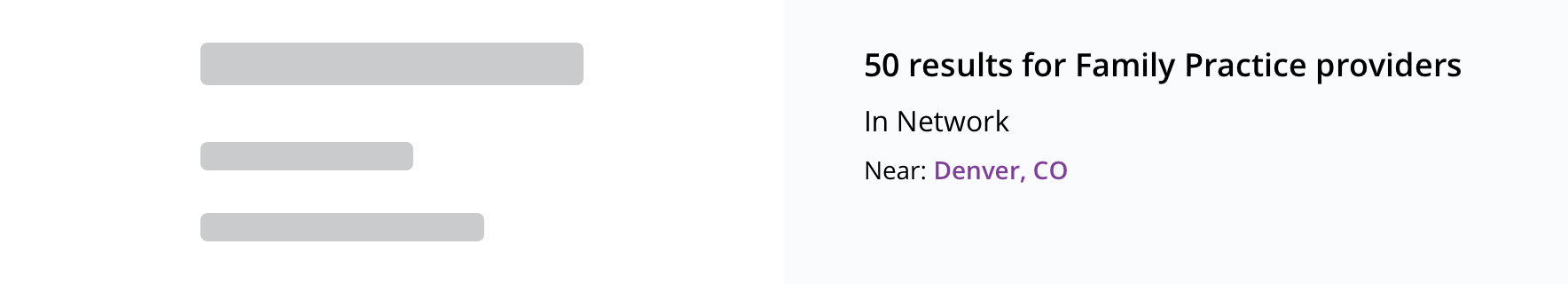 For pages with titles that are dependent on the loaded information, such as providing how many search results, use a skeleton to represent the page title
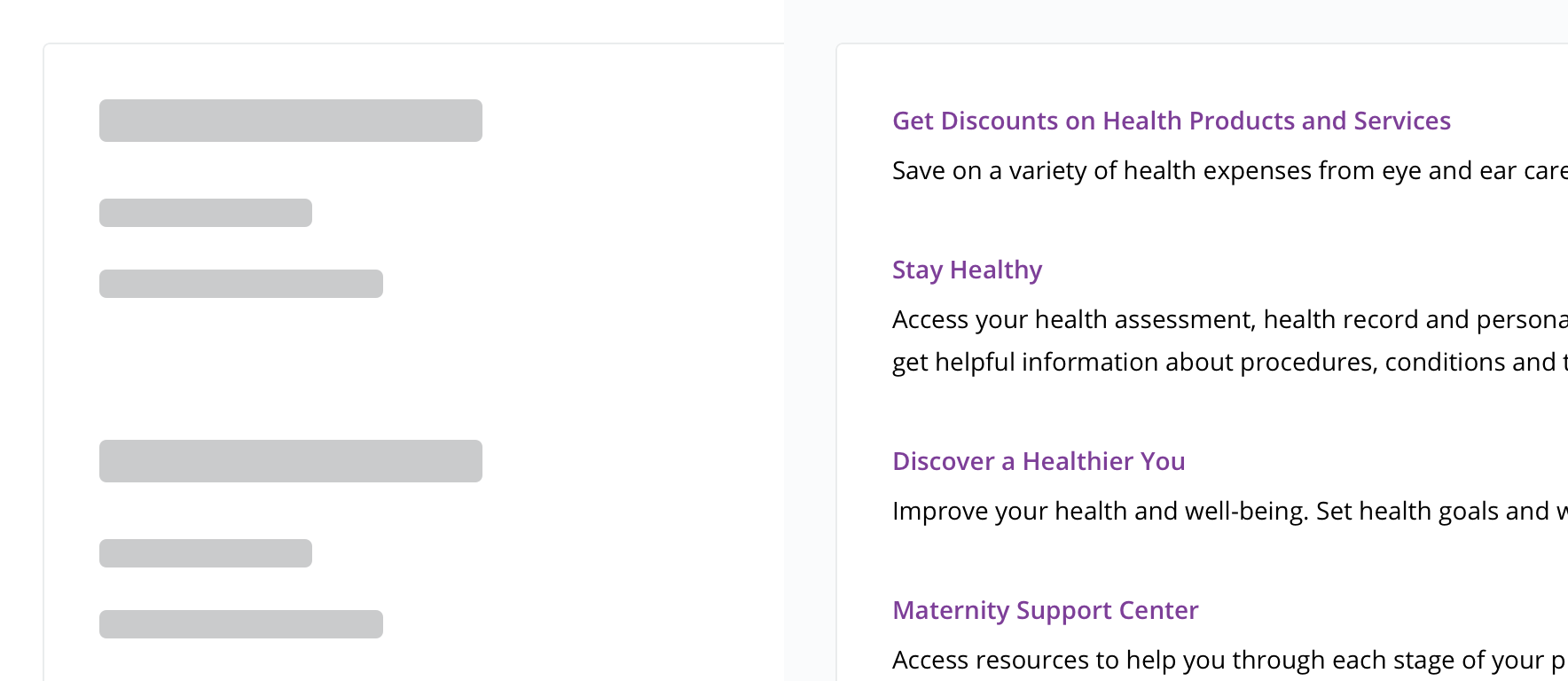
Text Lines
Use for text items, such as:
- List of links
- Vertical navigation
- List of expansion elements
- Supporting detail text
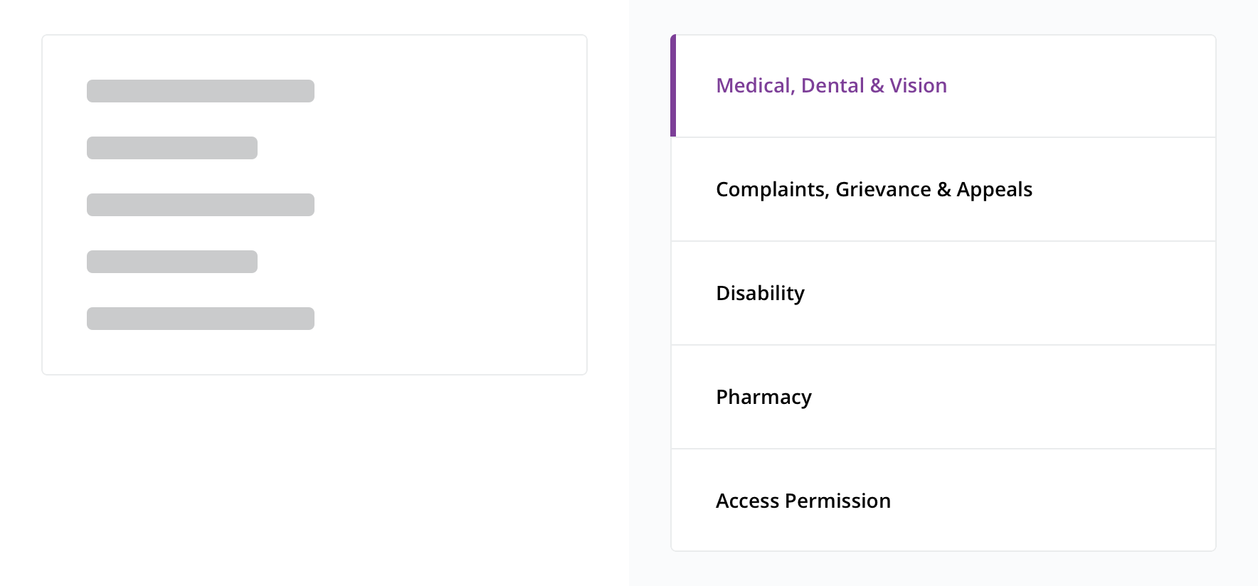 Use for vertical navigation
Circle List
 Use for simple lists that include a graphic, such as an avatar or icon
Header Group
 Use for repeated items that have a description
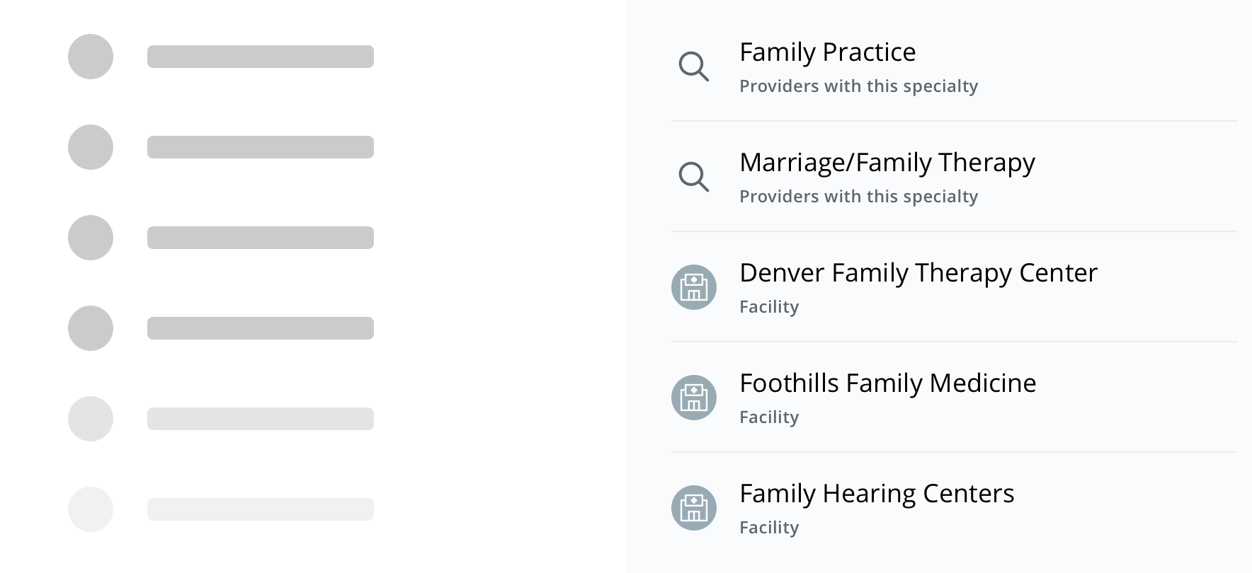
Circle Detail Group
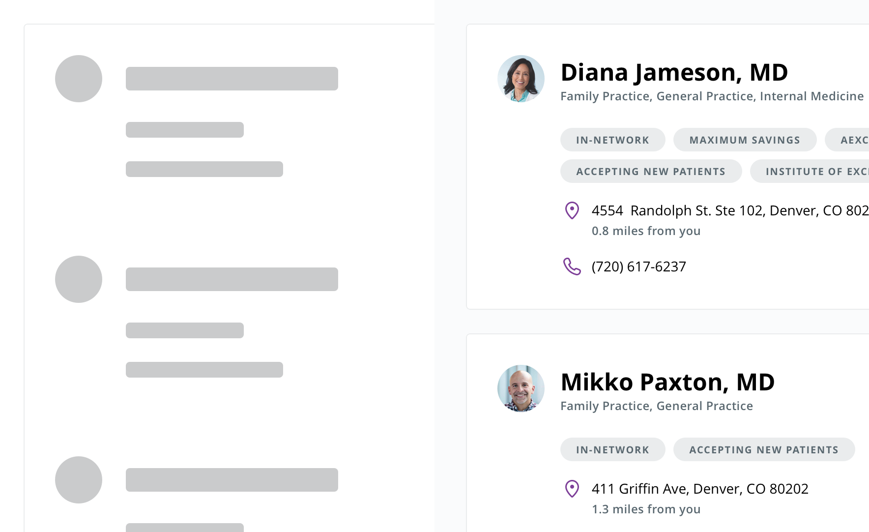 Use for more detailed items that contain a graphic, such as an avatar or icon, and supporting detail
Tabs
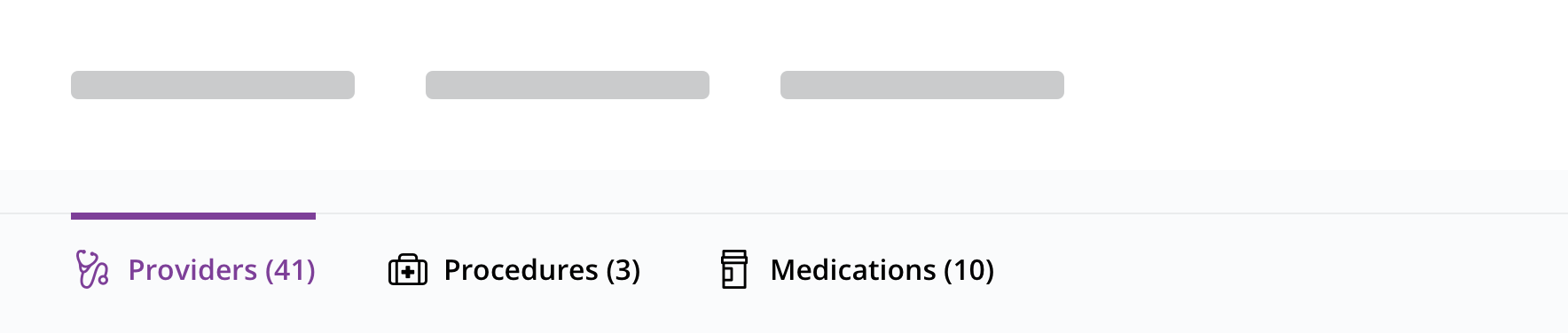 Use for tabs or similar horizontally placed elements
Table
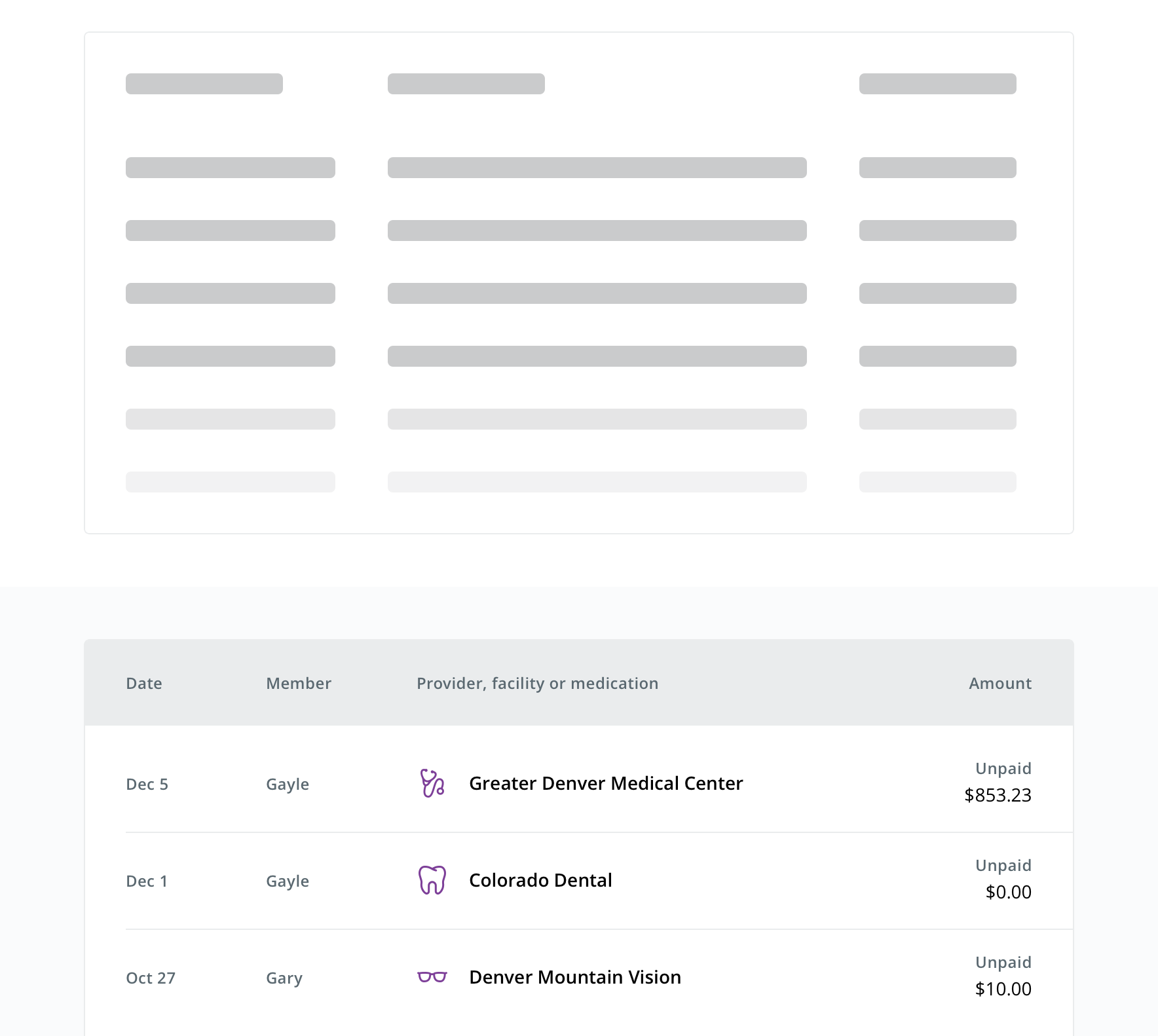 Use to represent tabular data
Custom
Use sparingly
While a custom option is available for elements that don't fit into a set type, this option should be sparingly used.
Use when one of the other types cannot communicate the structure of content the skeleton is meant to represent. This includes all the component shapes available to use.
Behavior
- Pages should replace skeleton types with loaded content as it becomes available (known as progressive loading)
- In smaller containers and breakpoints, skeletons adhere to the containing element’s width and proportionally get shorter
- On mobile, Table changes to Header List
Visual style
Each Skeleton type can be displayed in a card-like container (wrapper) or by itself.
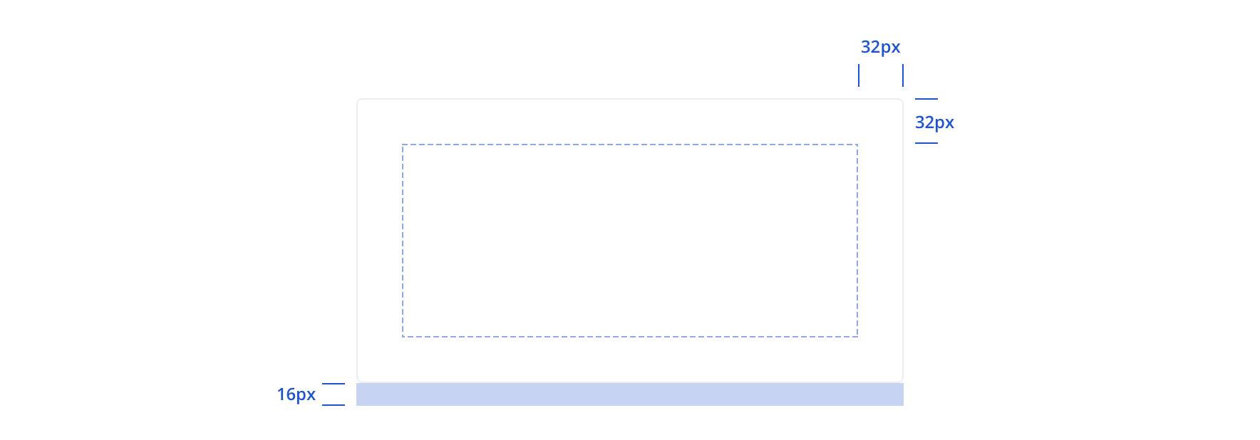 The wrapper has 32px padding and a 16px bottom margin
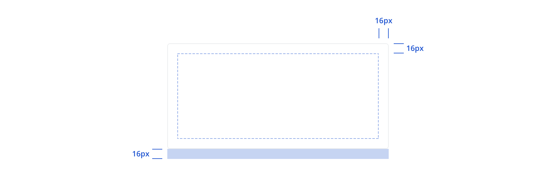 On mobile, wrapper padding is 16px
 Skeletons can be displayed outside of the wrapper. This doesn't include any built-in margins and should follow spacing alignment with other content on the page.
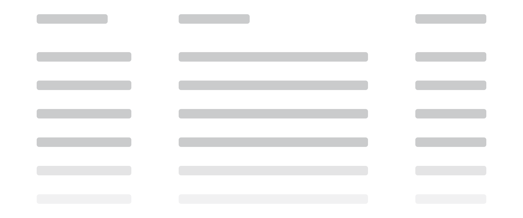
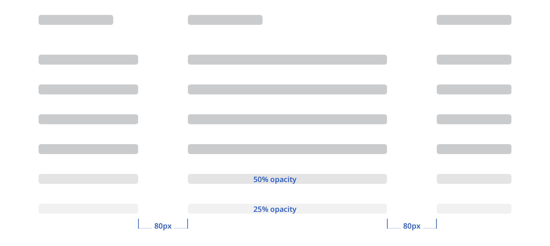
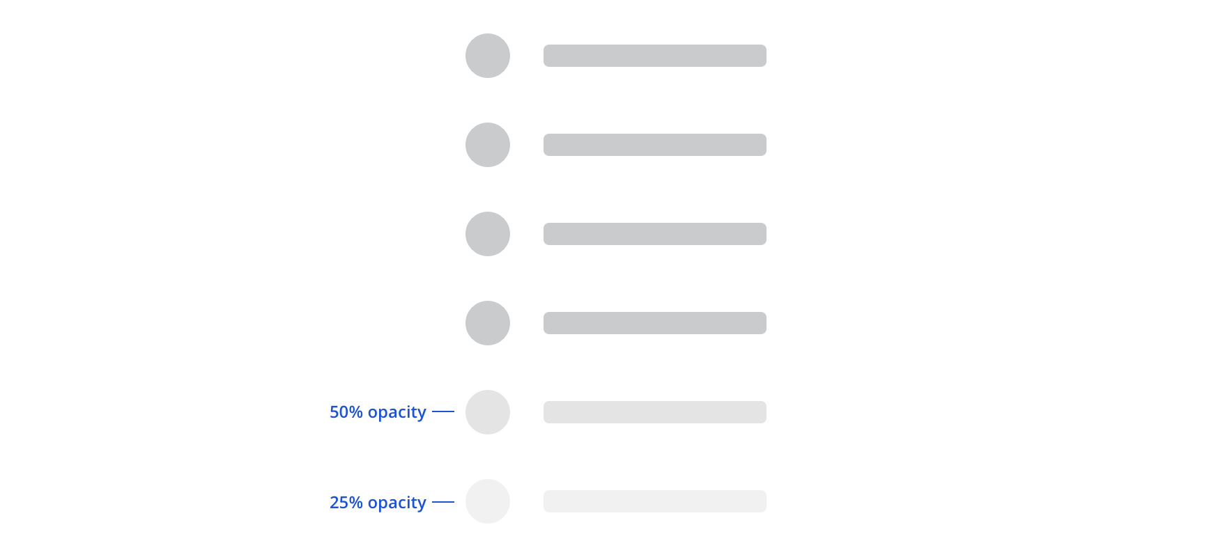 When Circle List, Header Group, Circle Detail Group, and Table have more than five items, the last two in the set will fade
Some of the types, like Text Lines, Circle List, Header Group, and Circle Detail Group, allow for repetition within the component.
While types like Header Group and Circle Detail group can be repeated, additional text lines can’t be added.

 These would be a custom skeleton
 Represent any horizontal elements with three tabs
 Tables should be represented with six rows
Custom
Custom gives you access to all skeleton shapes. Use existing spacing as you can and try to avoid:
- Less than 32px below headers
- Less than 24px between text lines
- Less than 24px between circles and text
Accessibility
Skeletons do not need to match AA contrast guidelines. On white, Skeletons have a ratio of 1.62 and on the app background color (#FAFBFC) have a ratio of 1.58.
Skeletons utilize aria-busy, so each implementation of this on a page will give screen reader feedback. Screen readers don’t fully support aria-busy, so “Loading” text is also included. This text isn’t visible, but will be presented to screen readers.